Kitchen Countertop Backsplash Pairing: What Works and Why

Kitchen Countertop Backsplash Pairing: What Works and Why
The moment you stand in your kitchen, two surfaces dominate your view: the countertop where you prep every meal and the backsplash that frames your workspace. Getting these two elements to work together through proper kitchen countertop backsplash pairing makes your kitchen feel cohesive, intentional, even luxurious. Get it wrong and something always feels slightly off like a great outfit ruined by one clashing accessory. This guide breaks down the design principles that professional interior designers use, so you can create a combination that works for your space, your style, and your budget.
Why Countertops Come First in Kitchen Countertop Backsplash Pairing
Most homeowners obsess over the backsplash before locking in their countertops they've got it backwards. The practical order, according to designers at Daltile and other industry sources, is cabinets first, countertops second, and backsplash last. Your countertop is the largest horizontal surface in your kitchen; it anchors the entire design. The backsplash then becomes a supporting player, not the star.
The 60-30-10 rule works like this: 60% of your color comes from cabinets, 30% from countertops, 10% from your backsplash, which creates visual hierarchy without chaos. Stick to three main colors maximum, a ratio that holds up across decades of design trends.
Undertones: The Secret Most People Miss When Matching Counters to Backsplash
Every material has an undertone that subtle warm, cool, or neutral cast that your eye picks up even when you can't consciously name it. This is where most countertop and backsplash coordination disasters begin. A homeowner picks a granite slab they love, then chooses a backsplash that looks fine in the showroom but clashes horribly on their wall. The culprit is almost always mismatched undertones.
Warm tones (creams, golds, browns, honey-colored woods) pair well with other warm shades. Cool tones (grays, blues, greens, charcoals) work best together. Mixing warm and cool isn't impossible, but it requires a neutral bridge typically white, black, or gray to prevent the colors from fighting each other. Before you buy anything, hold your countertop sample next to potential backsplash tiles under both natural and artificial kitchen lighting to see how to pair countertops with backsplash effectively. This simple test reveals more than any showroom display.
Kitchen Countertop Backsplash Pairings That Always Work
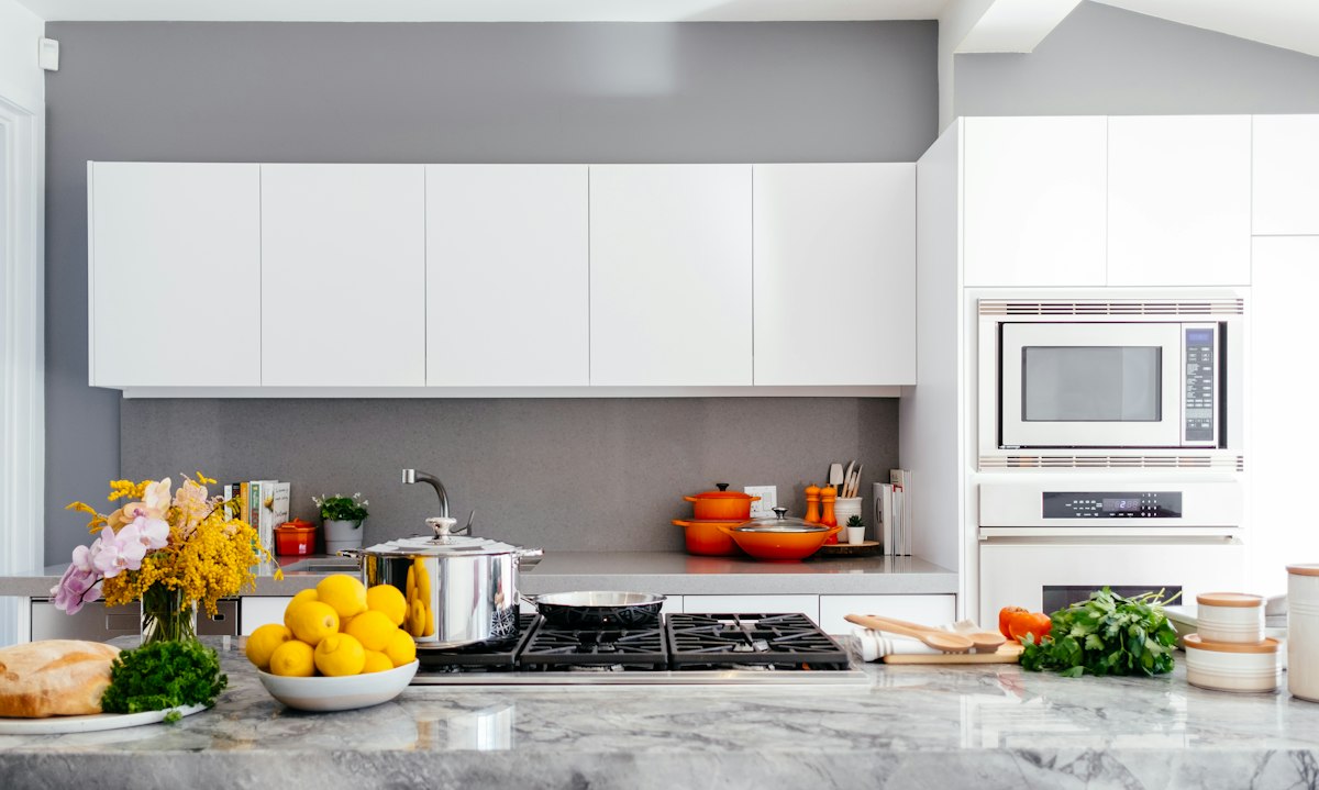
Some combinations have proven themselves across enough kitchens that designers return to them again and again. White quartz with marble herringbone remains a perennial favorite the subtle gray veining in the quartz picks up the pattern in the tile, creating harmony without repetition. Carrara marble and white subway tile creates that classic, timeless aesthetic that works in both traditional and modern kitchens. If you want something more textural, quartzite paired with zellige tile brings handcrafted warmth to contemporary spaces. When considering the best backsplash for quartz countertops, marble patterns and subway tiles consistently deliver results.
Balance drives all these pairings. A busy backsplash think intricate patterns, bold colors, or complex textures works best with a solid, relatively plain countertop. But when you've got dramatic countertops with bold veining or striking colors, you'll want to dial back the backsplash to something neutral and simple. Your eye can only process so much visual information at once, and the countertop typically gets more real estate.
Material Combinations for Kitchen Countertop Backsplash Pairing
Beyond color, material choice matters for successful kitchen surface pairing. Glass backsplashes reflect light and work beautifully with dark solid countertops, adding brightness to the space without competing for attention. Ceramic and porcelain tiles offer endless pattern options and tend to complement both stone and solid-surface countertops. Natural stone like marble or slate brings texture but requires more maintenance seal it properly or accept that staining is part of the deal.
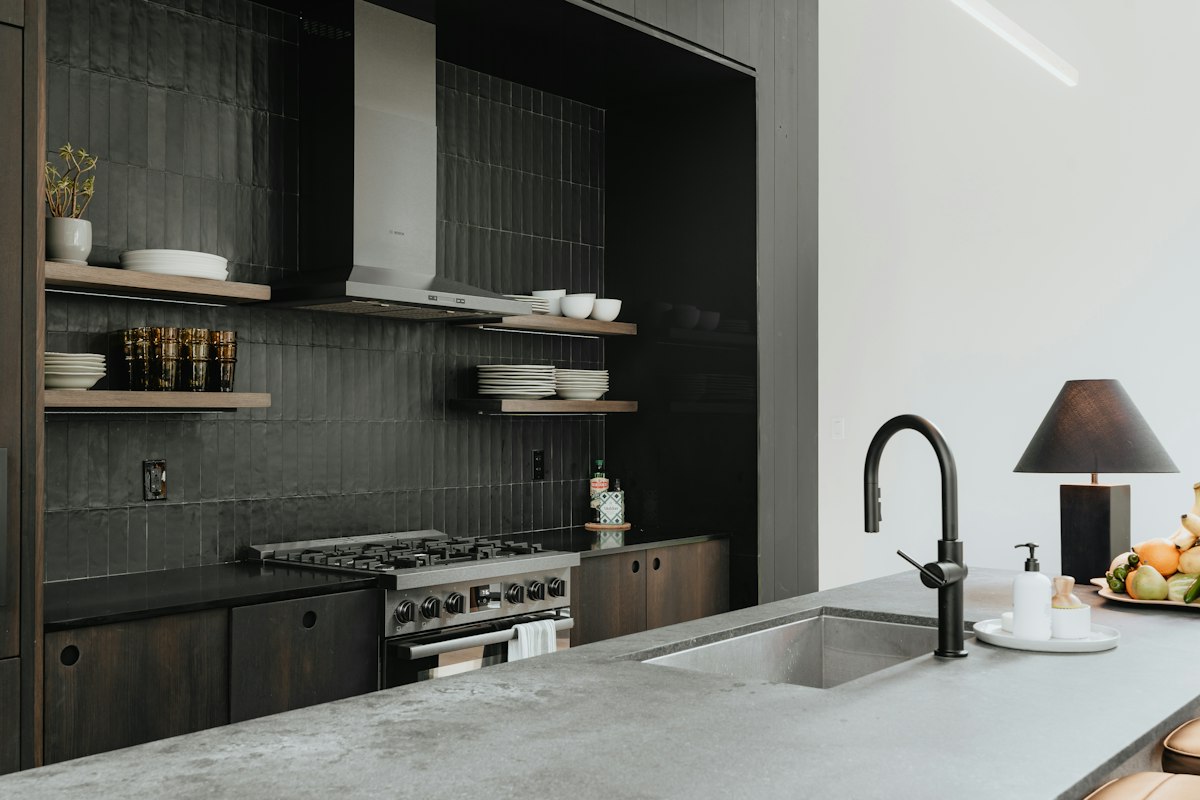
One combination that trips people up: mixing two highly polished surfaces. A glossy quartz countertop paired with a glossy glass backsplash creates excessive light reflection that can make a kitchen feel cold and clinical. Pair polished countertops with matte or honed backsplash tiles instead, or vice versa. This contrast in finish adds visual interest while keeping the overall feel balanced.
There's also the "countertop as backsplash" approach, where the same slab material runs from the counter up the wall. This creates a unified, high-end look that designers at Sweeten note is trending strongly. It's pricier since you need more material, but the visual continuity works well in open-concept kitchens where the backsplash is visible from multiple angles.
Common Kitchen Countertop Backsplash Pairing Mistakes
The most frequent error I see is trying to match too closely. Homeowners hear "coordinate" and interpret it as "make identical," leading them to choose backsplash tiles in nearly the same color as their countertops. The result looks accidental rather than intentional. You want your backsplash to complement your countertop picking up one color from the stone's pattern, echoing its temperature, or providing contrast that makes both surfaces shine.
Ignoring the rest of the kitchen is another misstep. Your backsplash doesn't exist in isolation it needs to work with your flooring, your cabinet color, and your lighting. Busy flooring means simple countertop and backsplash. Dark cabinets need a lighter backsplash to prevent the space from feeling oppressive.
Lighting is the variable most people forget to test. A backsplash that looks perfect in natural daylight can look completely different under your kitchen's overhead lights or pendant lighting. Always view your material samples in your actual kitchen, at different times of day, before making your final decision.
Budget Reality Check
You don't need expensive materials to achieve a cohesive look, despite what the design industry suggests. A porcelain tile that mimics marble costs far less than actual marble and requires less maintenance. Solid-surface countertops like quartz offer consistent color and pattern, making coordination easier than with natural stone where each slab is unique.
If you're working with a limited budget, prioritize your countertop it's the surface you'll touch, prep on, and look at every day for years. Spend less on the backsplash but choose a timeless shape (subway tile never goes out of style) in a color that coordinates with your countertop's undertones. You can always update the backsplash later when your budget allows; replacing a full countertop is a much bigger undertaking.
One area where I couldn't find clear consensus: whether matching the backsplash to the countertop exactly creates a continuous look or just looks like you couldn't make decisions. The "same-as-countertop" approach works beautifully when done intentionally with the right material, but it requires commitment you need enough material for both surfaces, and any future replacements need to match. It's a bold move that pays off in modern, minimalist kitchens but can feel limiting if your tastes shift over time.
Choose your countertop first. Find a backsplash that either picks up a color from your stone or provides clean contrast. Test everything under your actual kitchen lighting, because what looks good in a showroom can read completely different under your specific bulbs and natural light angles.